Motionspot · Freelance UX Designer · 2023 · 1 month design, 2 months delivery
Accessible-first design: beyond WCAG compliance
A self-service accessibility audit tool for commercial buildings, designed to practise the same accessible-first principles it exists to promote.
Overview
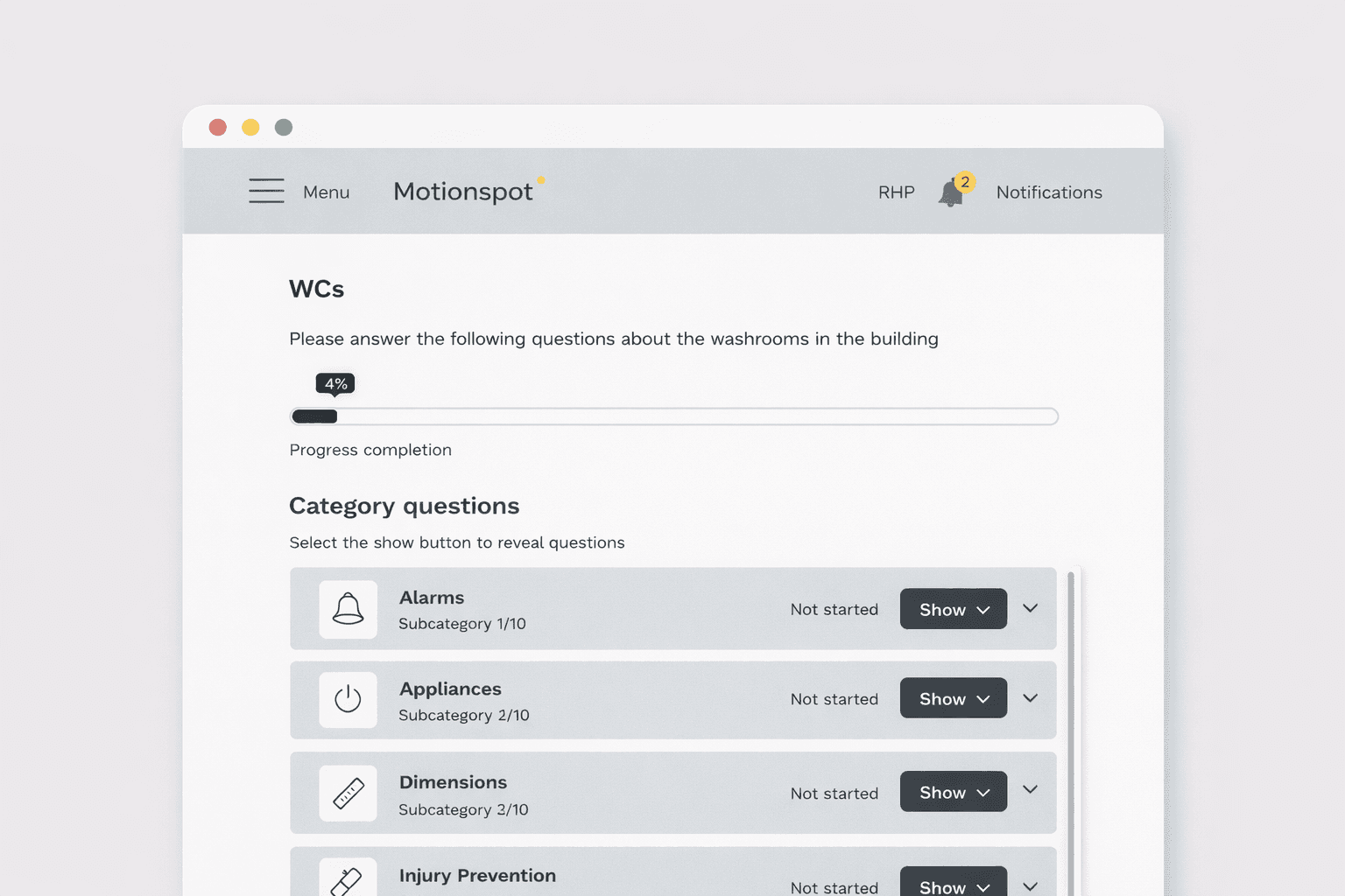
Motionspot is an inclusive design consultancy that creates beautifully accessible, welcoming built environments — spaces that work for everyone, not just the able-bodied majority. My brief was to design a web-based tool, backed by government funding, that lets commercial clients such as hotels and real estate companies self-assess the accessibility of their own buildings: clear guidance, actionable recommendations, and support for a wide range of access needs.
The brief wasn't just “design an audit tool.” It was to design a product that practised what Motionspot preaches. If the tool itself wasn't accessible-first, it would undermine the very mission it was built to serve. That framing shaped every decision that followed, from interface to testing.
I approached the project around four accessible-first principles.
1. Simple interface design: building an accessible design system
Motionspot's identity is built on the idea that inclusive design shouldn't look clinical or compliance-driven. It should feel warm, human, and considered. The tool had to carry that same spirit: not a dry checklist dressed up as software, but an interface that felt as welcoming as the spaces Motionspot designs in the physical world.
With no in-house UX or dev team at the consultancy, and a tight government-funded timeline, I built a lightweight design system aligned to Motionspot's brand, covering typography, colour, spacing, and core component patterns, so the tool would feel unmistakably theirs, not a generic SaaS template. This also gave the outsourced development agency a single source of truth, smoothing handover without a lengthy back-and-forth on visual decisions.
2. Minimal friction experience: task-driven flows built on real jobs
Accessibility audits can be dense, jargon-heavy, and easy to abandon halfway through. To avoid that, I kicked off with a Jobs-to-Be-Done workshop with the consultancy, working through four questions:
- What is the core job the user is trying to achieve?
- What steps do they go through to complete it?
- Where do they struggle today?
- What outcomes actually matter to them along the way?
Mapping the jobs, sub-jobs, and tasks gave us a job map that became the backbone of the tool's structure, so rather than guessing at features, every screen mapped back to a real step in a real audit. Alongside this, I ran a competitor analysis (SafetyCulture and similar self-service audit tools) to see how other products handled complex, multi-step processes: how they sequenced tasks, presented recommendations, and kept users moving forward without overwhelming them.
The result was a step-by-step audit flow that broke a genuinely complicated compliance task into small, achievable actions: minimal friction where friction serves no purpose, and clear signposting everywhere else.
3. Modality: designing for different access needs, not one default user
An accessibility tool that only works well for one kind of user is a contradiction. Inspired by Monzo's thinking on designing for customers with mental health difficulties, where small, optional adjustments (preferred contact method, added checks at moments of vulnerability) made a mainstream product genuinely work for people it would otherwise fail, I wanted the audit tool to offer modality: ways for people to adjust the experience to their own access needs, rather than a single fixed interaction pattern for everyone.
For a tool auditing physical accessibility, that meant thinking beyond visual polish toward how the product itself could flex: alternative ways to input and review audit data, adjustable pacing through a long assessment, and guidance that could be surfaced in more than one format depending on how a user processes information. It's a principle I'd carry further given more time and budget, treating “one interface, one way of using it” as a design smell rather than a default.
4. Testing with disabled users: beyond the WCAG checklist
It's easy for accessibility work to collapse into a compliance exercise: hit the WCAG success criteria, tick the box, move on. That's necessary but not sufficient. The real test of an accessible-first product is whether disabled users can actually get their job done in it, comfortably, not just technically.
Given the constraints of a one-month proof-of-concept with no in-house research resource, this is also the area I'd push hardest on in a next phase: structured usability testing with disabled users across different access needs, not just an automated audit or a designer's best guess at “accessible enough.” We ran design critique sessions with several team members at Motionspot who were able to bring lived experience of disability into the design process, surfacing usability issues that an audit checklist alone wouldn't catch.
Impact
- Delivered a functional, developer-ready prototype within two months, despite the tight timeline: a lightweight design system, a validated task flow grounded in real jobs-to-be-done, and clear handover assets for the development agency.
- The project is currently on hold pending further government funding, but the foundation, and the accessible-first thinking behind it, is ready to pick back up when it is.